
Coding Cody
css만으로 slidebar- checkbox 본문
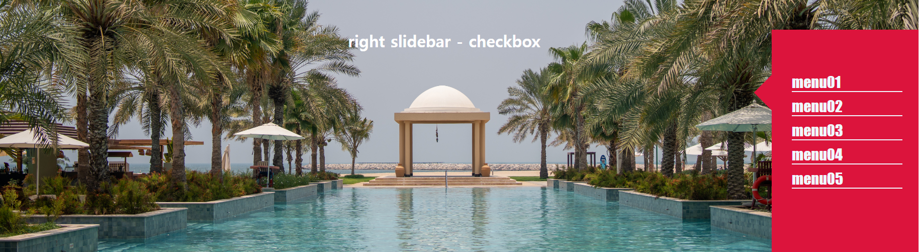
HTML
<input type="checkbox" id="chkbox">
<h1> right slidebar - checkbox </h1>
<label for="chkbox" class="span-area">
  <span></span>
</label>
<div class="sidebar">
	<ul>
		<li> <a href="#"> menu01 </a> </li>
		<li> <a href="#"> menu02 </a> </li>
		<li> <a href="#"> menu03 </a> </li>
		<li> <a href="#"> menu04 </a> </li>
		<li> <a href="#"> menu05 </a> </li>
	</ul>
</div>
CSS
body{background-image: url(	https://images.pexels.com/photos/17520813/pexels-photo-17520813.jpeg);
    height: 100vh;
    width: 100%;
    background-size: cover;
    background-position: center center;
    -webkit-background-size: cover;
  position: relative; color:#fff;}
h1{margin-top: 60px; text-align:center;}
.sidebar{
	width: 300px;
	background-color:crimson;
	height: 100vh;
	top: 0;
	right: -300px;
	position: absolute;
	transition: all 0.5s;
}
	.sidebar ul {
		padding: 20% 40px;
		list-style: none;
		justify-content: center;
		align-items: center;
	}


	.sidebar li {
		padding: 0px;
		padding-top: 10px;
		border-bottom: 2px solid aliceblue;
	}


	.sidebar a {
	 text-decoration: none;
	 font-size: 30px;
	 font-weight: 300;
	 font-family: Impact, Haettenschweiler, 'Arial Narrow Bold', sans-serif;
	 color: aliceblue;
	}
/*버튼 구간입니다.*/
input[id="chkbox"]{
	display: none;
}
.span-area{
	position: absolute;
	background-color:transparent;
	width: 50px;
	height: 50px;
	top: 100px;
	right: 0;
	transition: all 0.5s;
}

.span-area span {
	position: absolute;
	height: 50px;
	width: 50px;
	background-color: crimson;
	right: -25px;
  transform: rotate(45deg);
	transition: all 0.5s;
}

.span-area span:nth-child(1) {
	top:0;
}

input[id="chkbox"]:checked~.span-area span:nth-child(1) {
	top:50%;
	transform: translateY(-50%) rotate(45deg);
}

input[id="chkbox"]:checked~.span-area {
right: 300px;
}


input[id="chkbox"]:checked~.sidebar {

right: 0px;
}
Result
See the Pen slidebar - checkbox by kkm (@oddoja) on CodePen.
'css' 카테고리의 다른 글
| All - cdn (0) | 2023.07.10 |
|---|---|
| fontawesome.com ::before, ::after (0) | 2023.03.24 |